Introduction
In this tutorial, we will be looking at how to render matplotlib graphs in Flask. Matplotlib is a python library used for creating static, interactive, and animated visualizations.
Table of Contents
Install modules
To begin we first need to install matplotlib which will be used to create the graphs and flask will be our web server. To install them open your terminal and run the commands below.
pip3 install matplotlib

pip3 install Flask
Create folders and files
To begin create a folder called flask_graphs, you can name it anything you like. Inside the folder create a file called app.py and a folder called templates. The templates folder will be used to store our HTML files, inside the templates folder create a file called index.html.
Import modules
Inside the file app.py let’s import a few modules as shown below.
import io
from flask import Flask, render_template, make_response
import matplotlib.pyplot as plt
from matplotlib.backends.backend_agg import FigureCanvasAgg as FigureCanvas
from matplotlib.figure import Figure
Initialize
Now we need to initialize our application, to do so add the following.
app = Flask(__name__)Route to generate the sales plot
Here we now need to generate our sales plot, here is the view.
@app.route('/sales')
def sales():
    # Car sales data
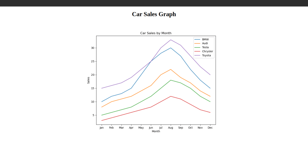
    bmw_sales = [10, 12, 13, 15, 20, 25, 28, 30, 27, 22, 18, 15]
    audi_sales = [8, 10, 11, 12, 14, 16, 20, 22, 19, 17, 14, 12]
    tesla_sales = [5, 6, 7, 8, 10, 12, 15, 18, 17, 15, 12, 10]
    chrysler_sales = [3, 4, 5, 6, 7, 8, 10, 12, 11, 9, 7, 6]
    toyota_sales = [15, 16, 17, 19, 22, 25, 30, 33, 31, 27, 23, 20]

    # Month labels
    months = ['Jan', 'Feb', 'Mar', 'Apr', 'May', 'Jun', 'Jul', 'Aug', 'Sep', 'Oct', 'Nov', 'Dec']

    # Create a new figure and axis object
    fig, ax = plt.subplots(figsize=(8, 6))

    # Plot the data for each car brand
    ax.plot(months, bmw_sales, label='BMW')
    ax.plot(months, audi_sales, label='Audi')
    ax.plot(months, tesla_sales, label='Tesla')
    ax.plot(months, chrysler_sales, label='Chrysler')
    ax.plot(months, toyota_sales, label='Toyota')

    # Set the chart title and axis labels
    ax.set_title('Car Sales by Month')
    ax.set_xlabel('Month')
    ax.set_ylabel('Sales')

    # Add a legend to the chart
    ax.legend()

    # Save the figure to a buffer
    buffer = io.BytesIO()
    canvas = FigureCanvas(fig)
    canvas.print_png(buffer)

    # Set the buffer's cursor to the beginning
    buffer.seek(0)

    # Create a response object
    response = make_response(buffer.getvalue())

    # Set the response's content type as PNG image
    response.headers['Content-Type'] = 'image/png'

    return response
Route to render the sales graph
Now let’s create a view to render the sales data. Add the code below.
# Route to render the template
@app.route('/')
def home():
    return render_template('index.html')


if __name__ == '__main__':
    app.run(debug=True)
Create templates
Let’s now create a template to display our graph, in the templates folder created above create a file index.html and add the code below.
<!DOCTYPE html>
<html>
<head>
	<title>Car Sales Graph</title>
</head>
<body>
    <style>
        .heading {
            text-align: center;
            color: black;
        }
        .plot-file {
            text-align: center;
        }
    </style>
	<h1 class="heading">Car Sales Graph</h1>
        <div class="plot-file">
            <img src="{{ url_for('sales') }}" alt="Car Sales Graph">

        </div>
</body>
</html>
Run
Now let’s run our application, to do so open your terminal and run the command below
python3 app.py You can also use the command below to start the server.
flask run Results
If all goes well your application should be available at the address [http://127.0.0.1:5000] in your browser. Here is the rendered graph as shown below.

There you have it, thanks for reading.


